
Abi Mason (Supporting Researcher)
Eila Roberts (Stakeholder)
Sue Hill (Stakeholder)
Helping
Students Navigate Academic Complexity Through Behavioral Design
Applying behavioral science to reduce friction, clarify choices, and improve academic decision-making for Michigan State University Integrative Biology Students.
Who I Worked With
My Role
Project Lead
Behavioral Research (Primary)
Prototyping & Design (Primary)
UX Writing (Primary)
Research Methods
Content Audit
Web Analytics
In-Person Interviews & Card Sort
Competitive Analysis
In-Person Moderated Usability Testing
Tools Used
Axure
Adobe InDesign
Adobe Photoshop
Flowmapp
Marvel Pop
The Challenge
How Can We Help Students Make Better Academic Decisions?
Students at large universities face overwhelming complexity in navigating their academic journeys, from choosing a major to securing experiential opportunities.
The Department of Integrative Biology at Michigan State University was home to more than 500 undergraduate students, four similar majors, and limited student resources. The Department needed to better understand how to support students in making informed academic decisions, and reaching their academic and career goals. I initiated, designed, and led this project.
In this project, I applied a behavioral design approach to uncover and address the hidden behavioral barriers preventing students from accessing academic resources, making informed degree choices, and connecting their academic paths to career goals.
Key Takeaways
By analyzing students’ mental models, decision-making patterns, and motivational needs, I developed a targeted intervention that could reduce academic decision friction, improve engagement with key resources, and help students navigate academic complexity more effectively.
Design Process
Discovery
During Discovery, I approached the research through a behavioral lens. This meant I analyzed the environmental triggers, cognitive barriers, and motivational gaps that shaped how students sought academic information and made degree-related decisions.
Students faced decision paralysis, cognitive overload, and difficulty connecting academic actions to future goals, leading to disengagement from essential resources.
Content Audit + Card Sort
Uncovering Students' Mental Models of Information
The undergraduate section of the Integrative Biology Website included 43 webpages. Many pages were outdated, text-heavy, and difficult to navigate.
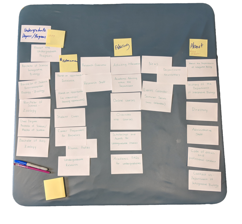
To better align the site’s structure with students’ natural thinking, we conducted a card sort exercise with student participants.
Each participant sorted cards representing existing website pages in a way that makes sense to their mental models. This exercise revealed how students categorized academic information and prioritized tasks.
By aligning the information architecture to students' cognitive patterns, we could reduce decision friction and increase engagement, making it easier for students to locate resources and take action.
Web Analytics
Identifying Navigational Barriers
I also analyzed several years of Google Analytics data, to identify patterns in how students interacted with the site in real life. Observing actual behavior reveals hidden shortcuts, friction points, and high-value entryways that can guide design decisions.
A pattern emerged in the data. Most users were bypassing the homepage via Google search and landing directly on specific pages, often repeatedly visiting the same ones. These insights were later confirmed in student interviews.
This reflected a common behavioral principle: users take the path of least resistance. Rather than navigating through the site’s structure, they chose the fastest route available. Below are the top-visited webpages.
#1 Undergrad Degrees
#2 Advising
#3 Overrides
#4 Undergrad Program
#5 Hands-On Opportunities Database
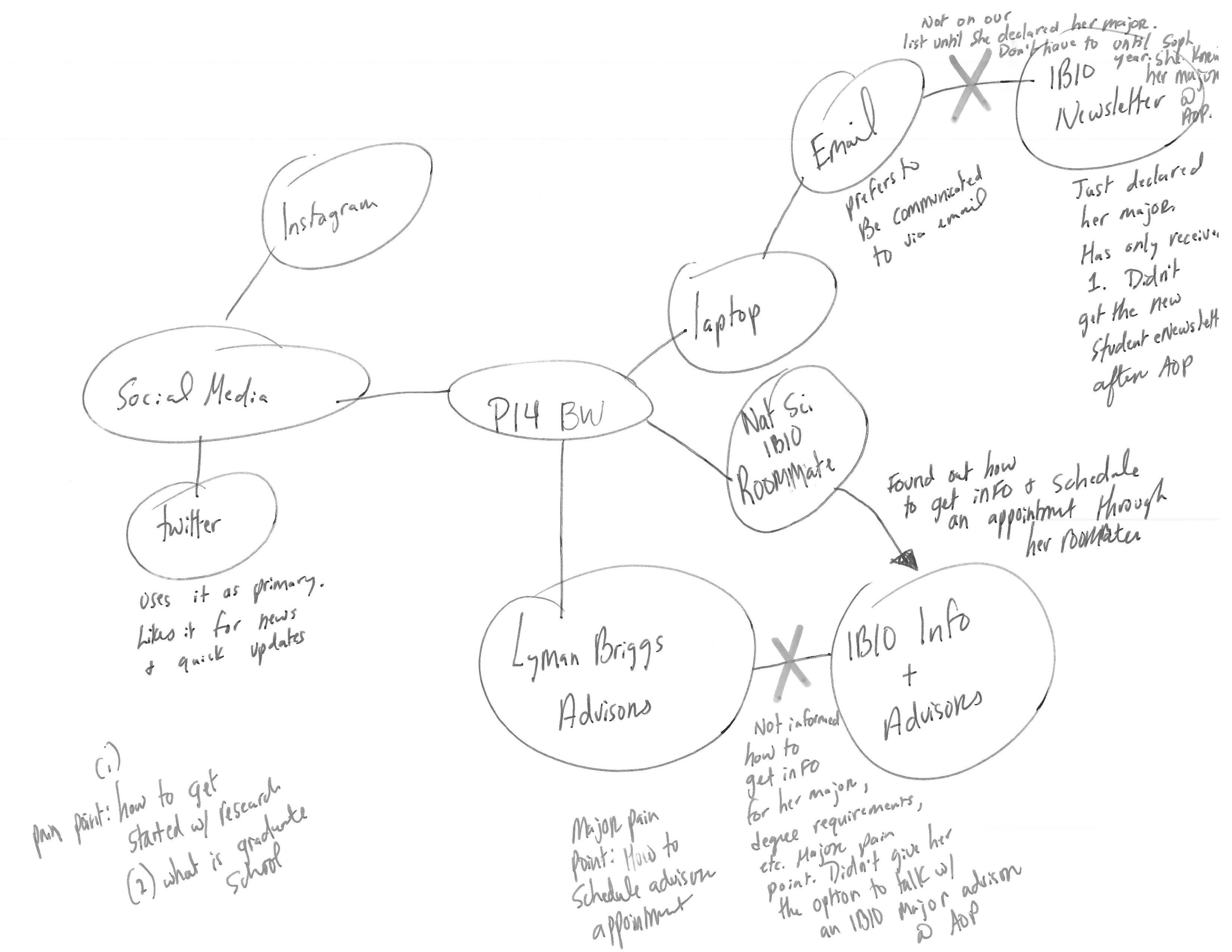
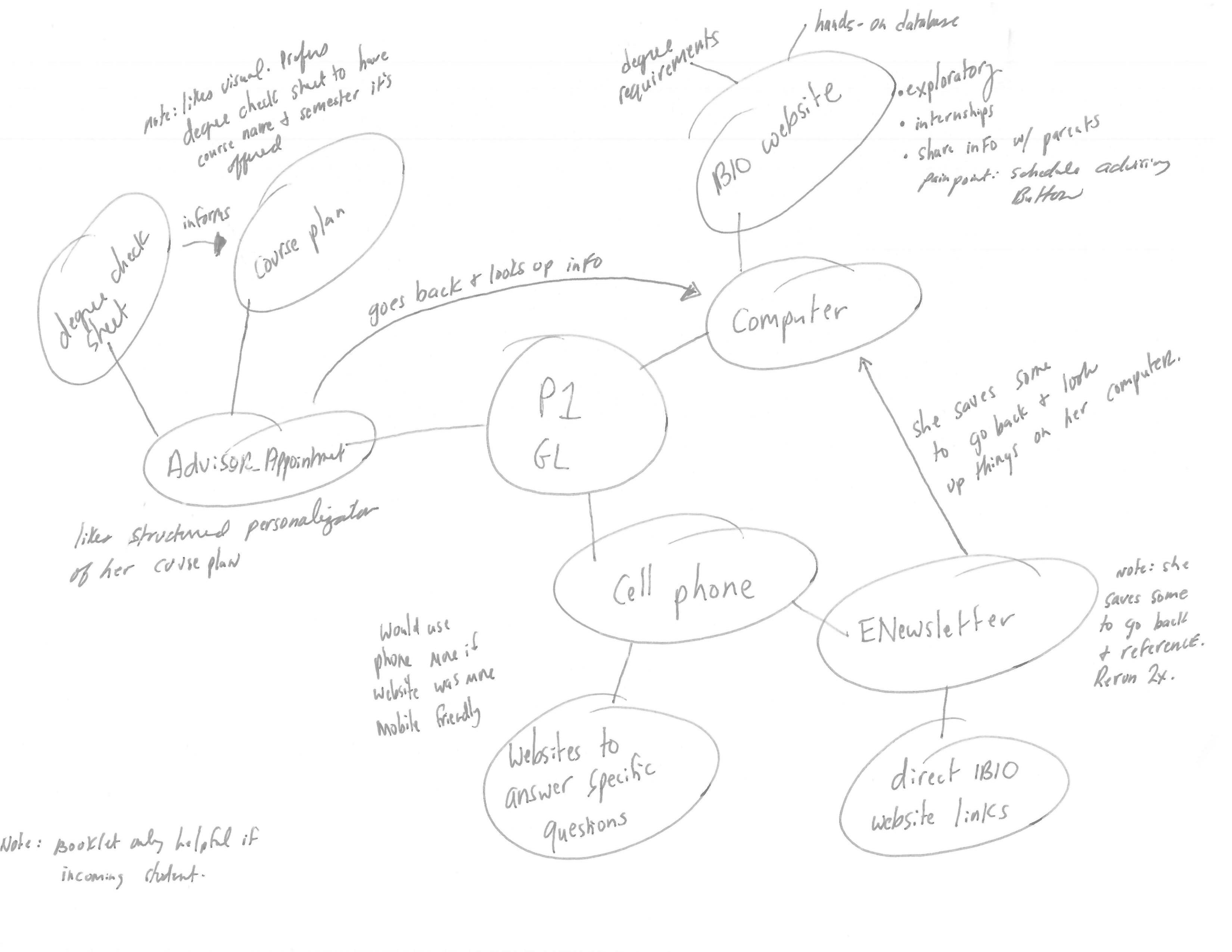
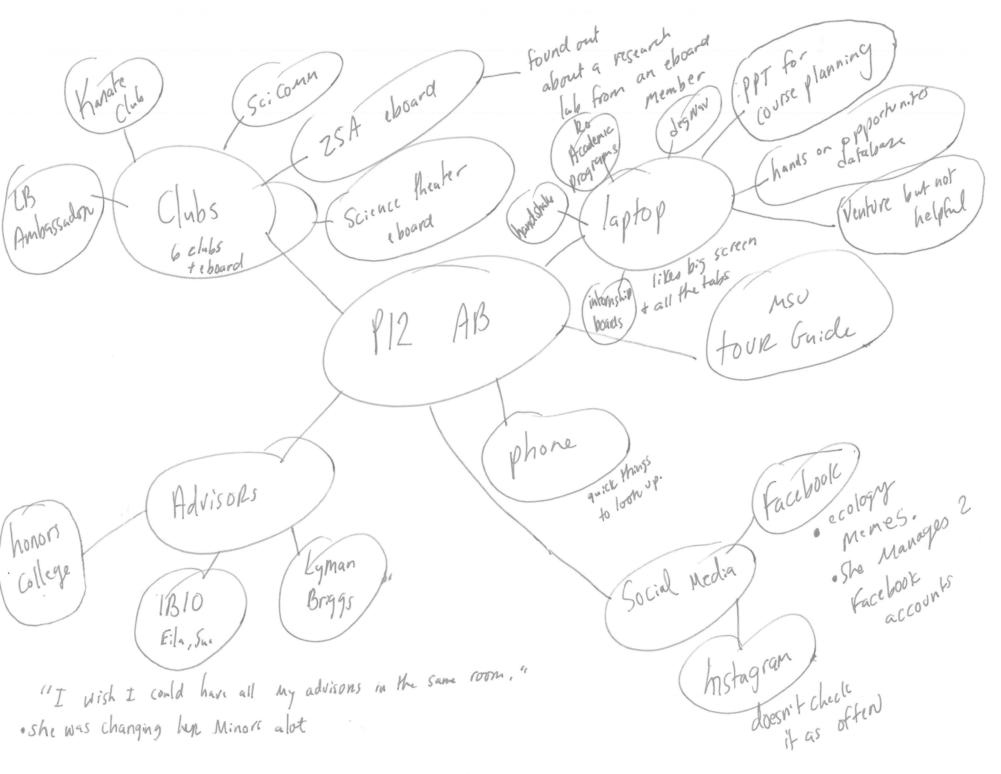
Student Interviews
Understanding Behavioral Barriers Through Direct Conversations
Together with a student intern, I recruited and interviewed 15 students from the Integrative Biology program, ensuring diversity across class standing, majors, and backgrounds.
These interviews uncovered:
- How students currently seek academic information
- Their academic and career planning challenges
- Their communication preferences and information habits
- Feedback on early design ideas
Throughout, I paid particular attention to the motivational drivers and barriers influencing their academic decisions.
Flow Models
Mapping Behavioral Ecosystems
During each interview debriefing, I developed flow models to visualize how students interacted with communication tools, identified pain points, etc. These models helped highlight the behavioral ecosystems surrounding students’ academic choices and habits.
Mapping out the student experience revealed that behavior was deeply shaped by the tools, timing, and environments surrounding their decisions, not just by the content itself.
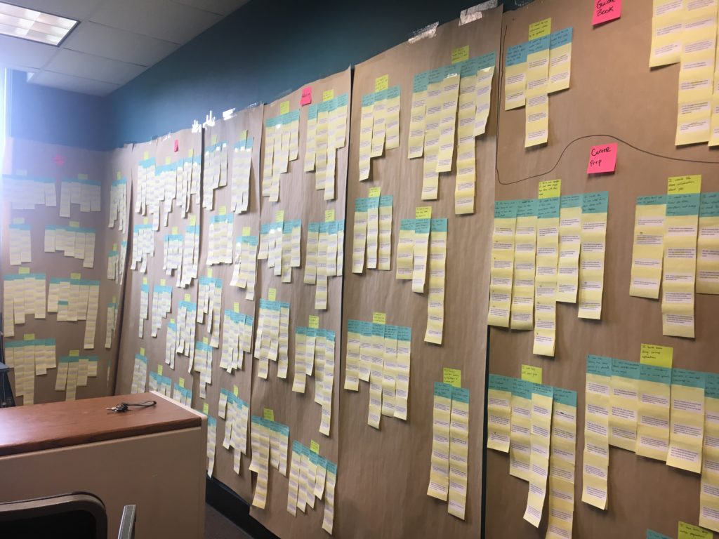
Affinity Diagram
Synthesizing Interview Data
Interview data were analyzed using an affinity diagram, a hierarchical grouping of affinity notes. We selected an affinity diagram because:
- It was an effective way to organize information across users to show common themes, challenges, and needs.
- All data could be viewed in one place.
- An affinity diagram allowed us to see patterns and themes in the data without losing the individual variation.
The affinity diagram was comprised of ~1,500 affinity notes (note: the photo only shows half of the completed affinity diagram). Key insights from the affinity diagram are described below.

User Journeys
What is the Student Experience Like?
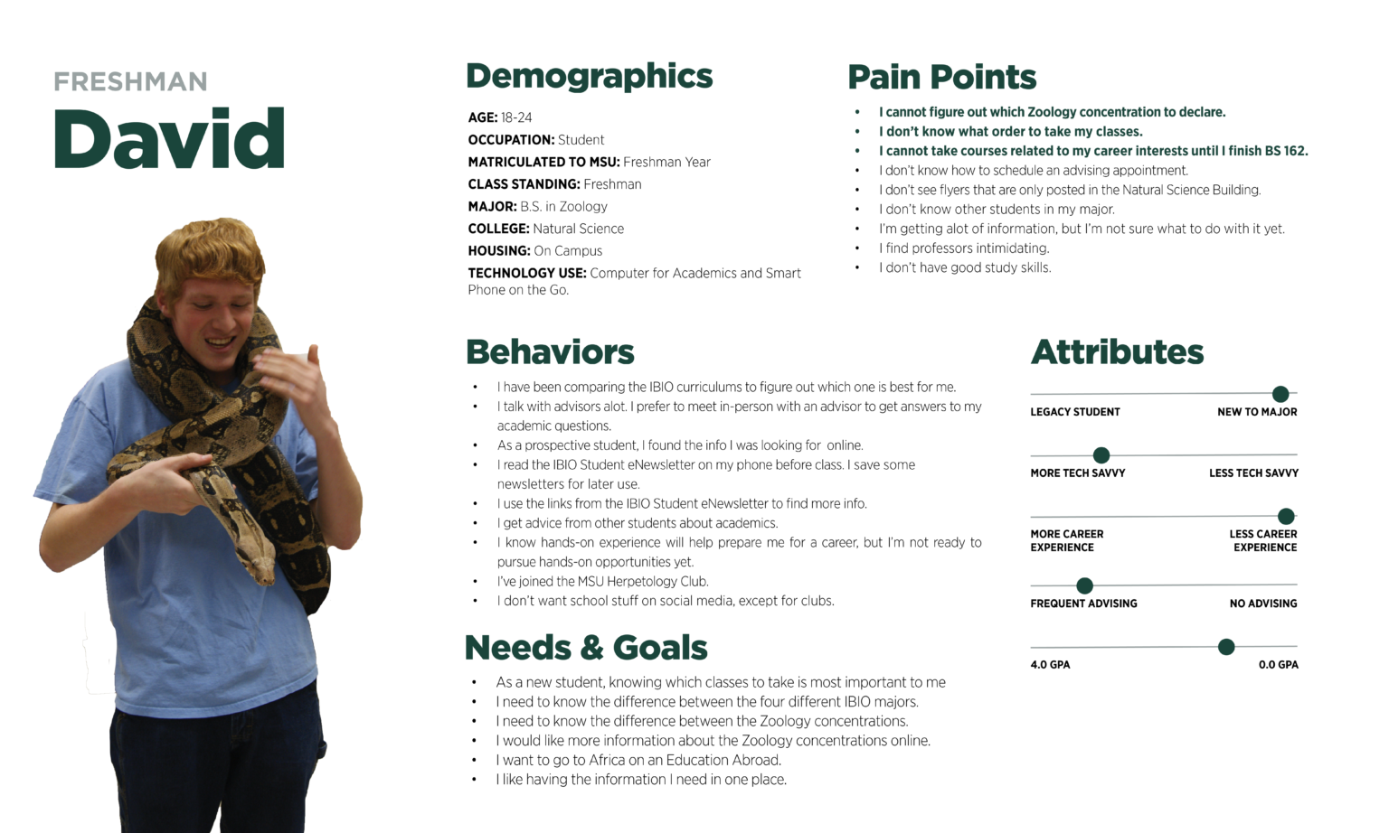
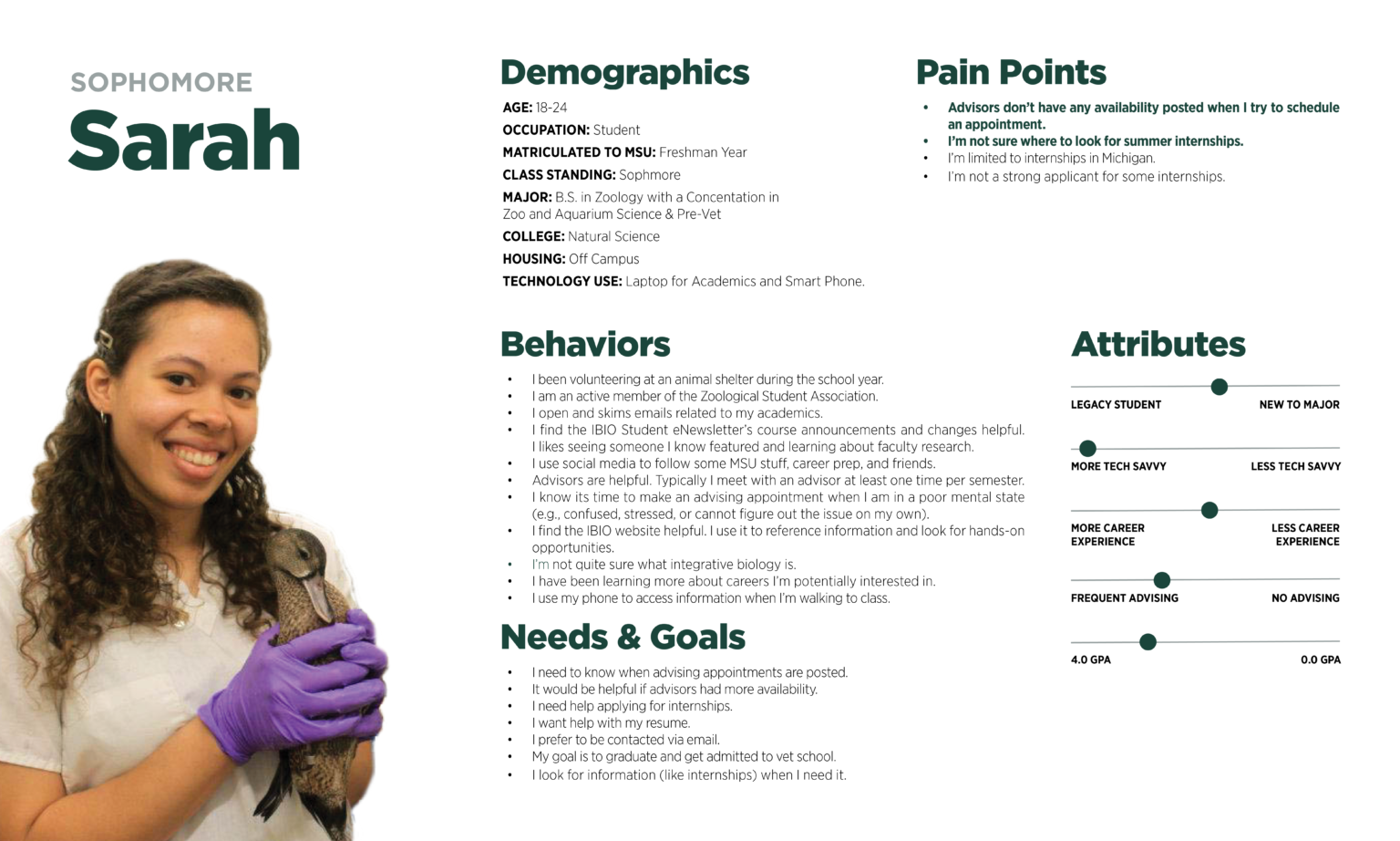
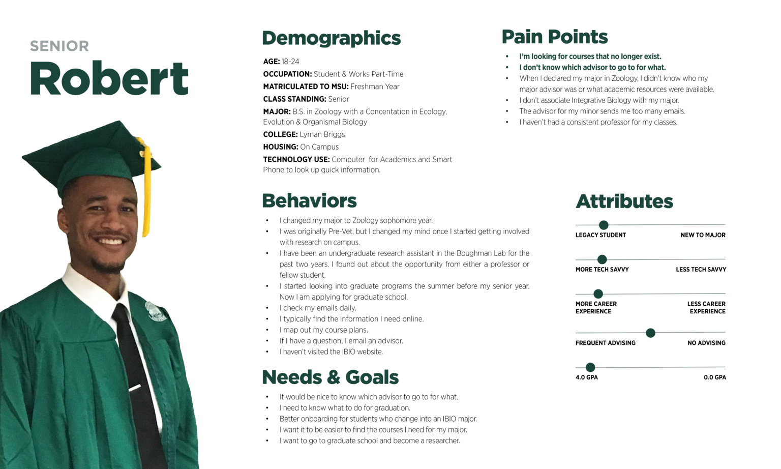
For each persona, we also mapped a behaviorally-informed user journey, tracing their goals, actions, and challenges throughout the academic experience.
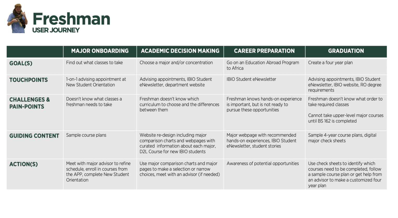
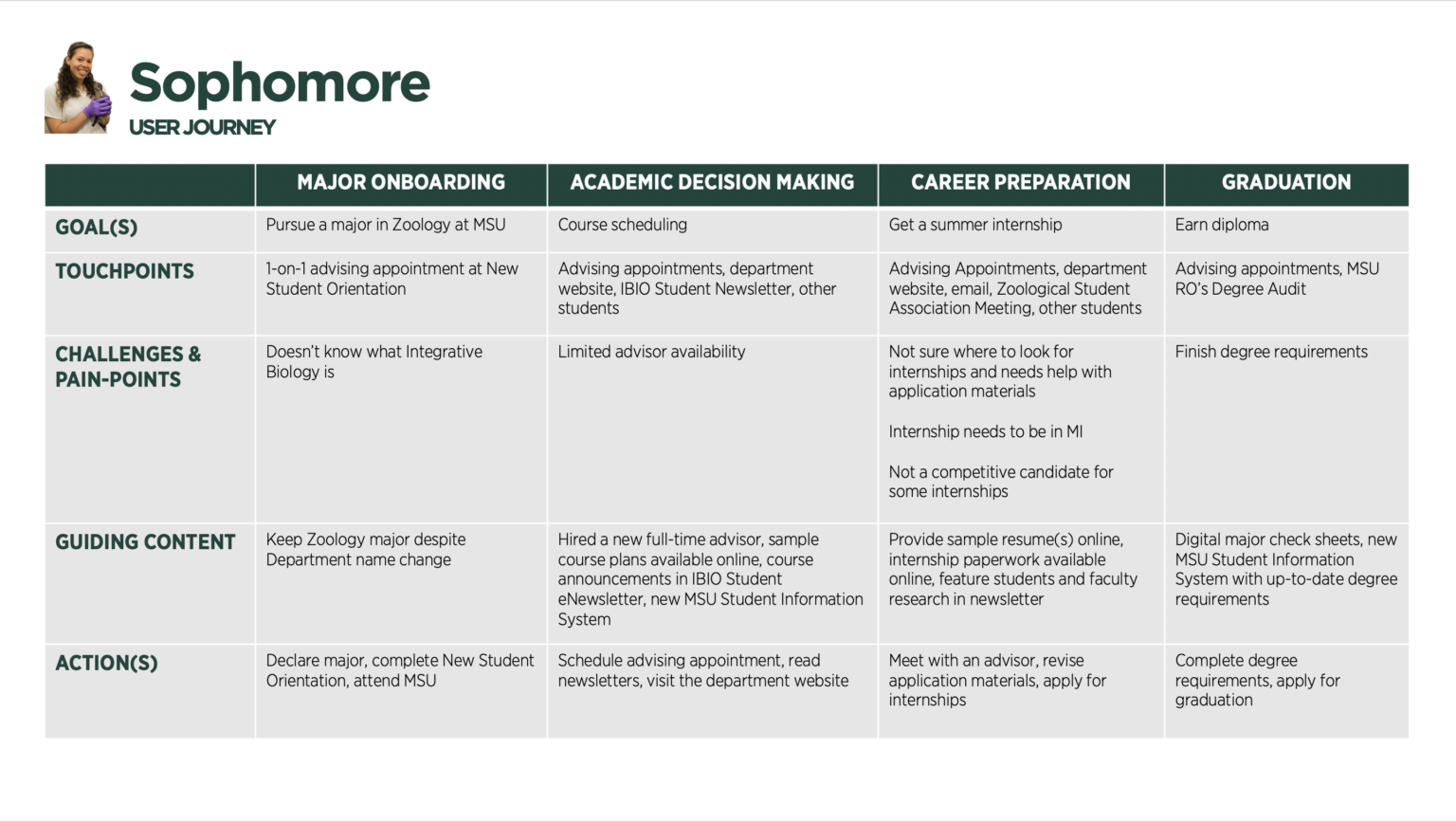
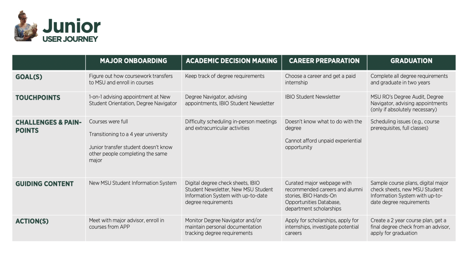
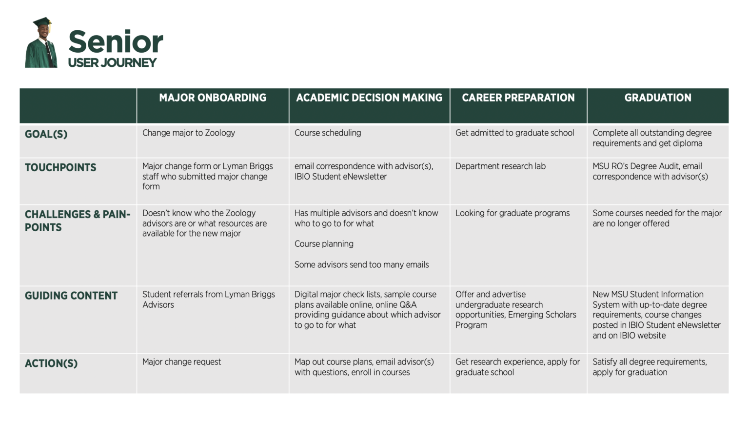
Key Behavioral Barriers Identified
Choice Overload: Students didn't know which major was best for them
- Students were overwhelmed by too many degree options, unclear differences between majors, and dense information, leading to indecision.
- Students often explored majors by comparing curricula online, but they needed more detailed information to help them determine which major best aligns with their interests and goals.
- How might we design a solution that allows students to easily compare the undergraduate degrees in the Department of Integrative Biology?
Cognitive Overload: Students struggled to find and synthesize the major info needed
Students search for information reactively, but they often face several challenges:
Students struggled to locate and process key information due to:
- Uncertainty about where to find the information they needed.
- Unclear search terms. They don't know what to search for.
- Difficulty synthesizing information from multiple sources.
- Overwhelm from excessive content.They struggle to sift through large volumes of information to find what’s relevant, reporting burnout from excessive reading.
- Lack of necessary information. Some resources they need don't exist.
Students would prefer to have all the information they need for their specific major in one consolidated space (e.g., complimentary minors, careers, jobs, etc.). However, careful balance is needed to avoid overwhelming students with too much information at once. How might we design this experience?
Students Struggle to Connect Their Major to a Career Path
- Many students couldn’t visualize the long-term benefits of academic decisions, like how their major connects to a career path, eading to low motivation to explore resources.
- Many students were exploring career options but feel uncertain about how to apply their degree. They wanted clear information on potential career paths, entry-level job opportunities, and the skills required for these roles. There was also confusion around graduate school options.
- IBIO students find it helpful to read about what their peers and alumni have done with their degree. Stories about alumni career journeys would be especially valuable, as would insights into the career trajectories of their professors.
- How might we create meaningful new content to help students navigate their career path?
Ideation
Our team generated over 200 design ideas grounded in student feedback. I led the sketching process to explore and communicate these ideas, intentionally using sketching as a low-effort, high-reward activity to encourage divergent thinking. Concepts ranged from student assemblies to curriculum redesign and website enhancements.
We prioritized the most promising ideas by evaluating behavioral impact (e.g., reducing decision friction, improving motivation) and feasibility. Our goal was to focus on solutions that would effectively remove the cognitive, motivational, and informational barriers identified during discovery.
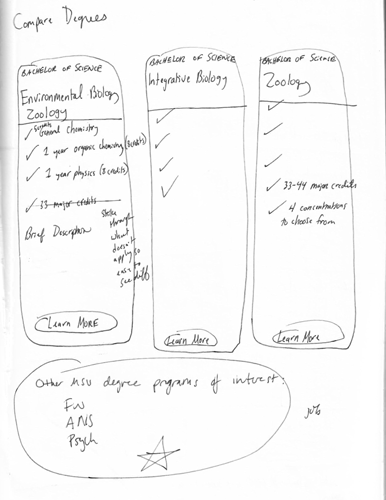
Comparing Degrees: Students struggled to differentiate between majors, reflecting choice overload. A comparison chart would help reduce decision complexity.
Major-Specific Webpage: Students requested curated content specific to their major to reduce cognitive load and ease academic decision-making.
Competitive Analysis
Competitors Weren't Implementing These Ideas
To benchmark our ideas, I conducted a competitive analysis of 10 peer departments nationwide. The findings revealed several key insights:
- Decision Support Tools: Sample course plans and course lists were common, but career planning resources were rare.
- Website Usability: Competitor websites were text-heavy with outdated designs.
This analysis confirmed that few institutions addressed Integrative Biology students' behavioral needs around decision-making and information processing, highlighting Michigan State University's opportunity to lead.
| Features | UC Berkley | Oregon State University | University of Wisconsin | Oklahoma State University | University of Illinois |
|---|---|---|---|---|---|
| Major Comparison Chart | |||||
| Comprehensive Major Page | |||||
| Sample Course Plans | |||||
| Hands-On Opportunities Database | |||||
| Sample Resume | |||||
| Sample Cover Letter | |||||
| Academic FAQs | |||||
| Course List | |||||
| Alumni Career Stories | |||||
| Visuals | Limited visuals. Text-heavy. | Limited visuals. Text-heavy. | Occasional hero images. No visuals of students. | Limited visuals. Small & hard to see. | |
| Videos | Student Life Video | Prospective Student Video & Undergraduate Research Video | |||
| Modern Web Design |
Recommendation: A Website Redesign
Despite some successful student-centered webpages, the Department of Integrative website lacked a comprehensive human-centered and behaviorally-informed design approach.
Redesigning the website's information architecture, content, and design was essential to reduce cognitive load and enable students to navigate more effectively. The website needed to:
- Simplify decision-making processes
- Support proactive academic planning
- Increase accessibility to academic resources
The initial focus was on high-impact, high-need features that directly addressed behavioral barriers.
Design & Testing
Sitemap
Improving Findability
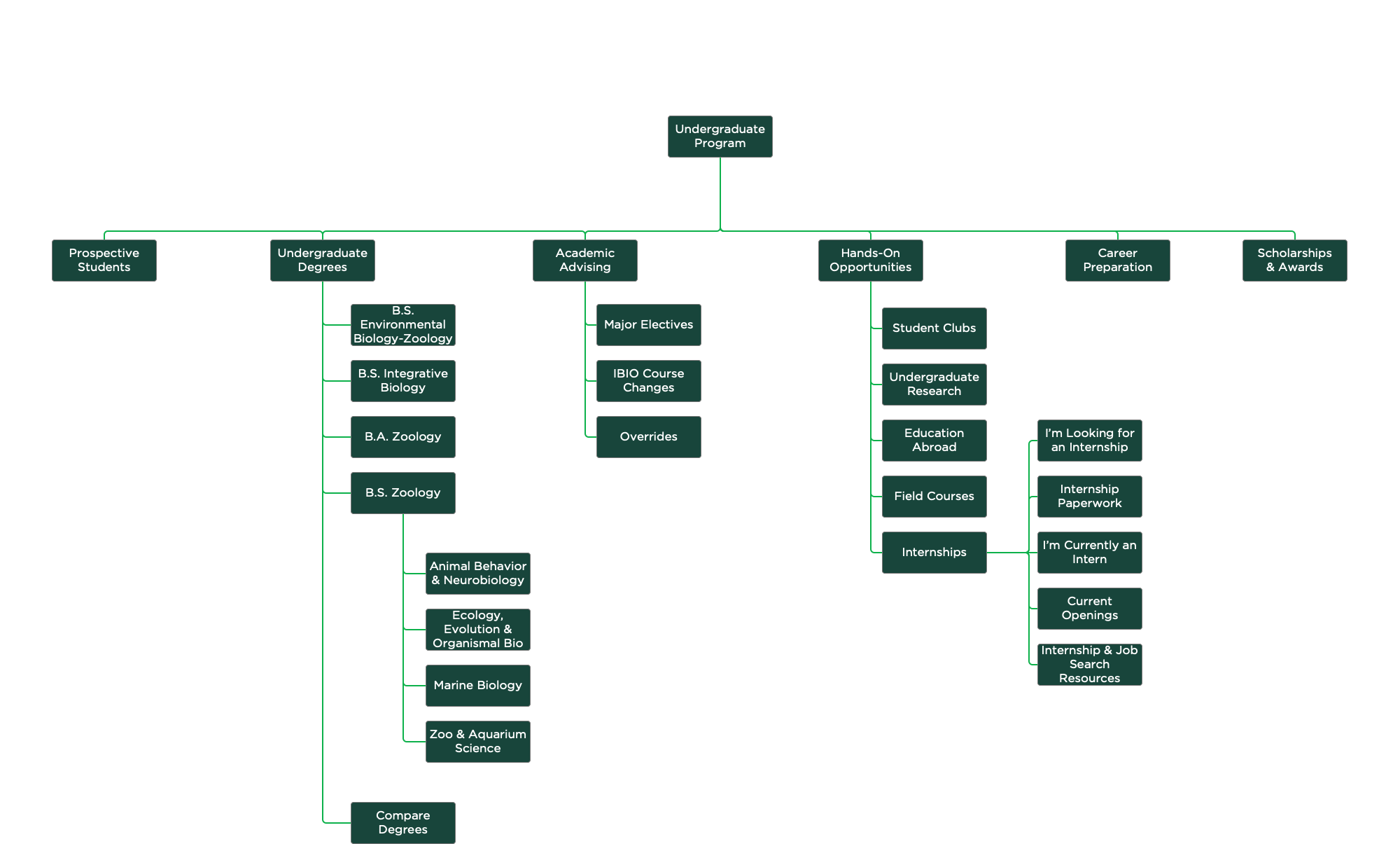
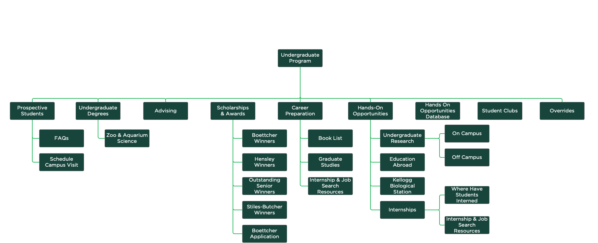
I reorganized the website's information architecture to align with students' mental models, reducing the total number of pages from 43 to 27. Every page could be reached in 3 clicks or less, simplifying navigation and improving findability.
This reduction in complexity also reflects the behavioral principle of choice architecture. By limiting options and structuring pathways clearly, students' cognitive burden is reduced, enabling faster and more confident decision-making.
New Sitemap
Old Sitemap
Content Design, Paper Prototype, & Usability Testing
Testing Preliminary Design Ideas
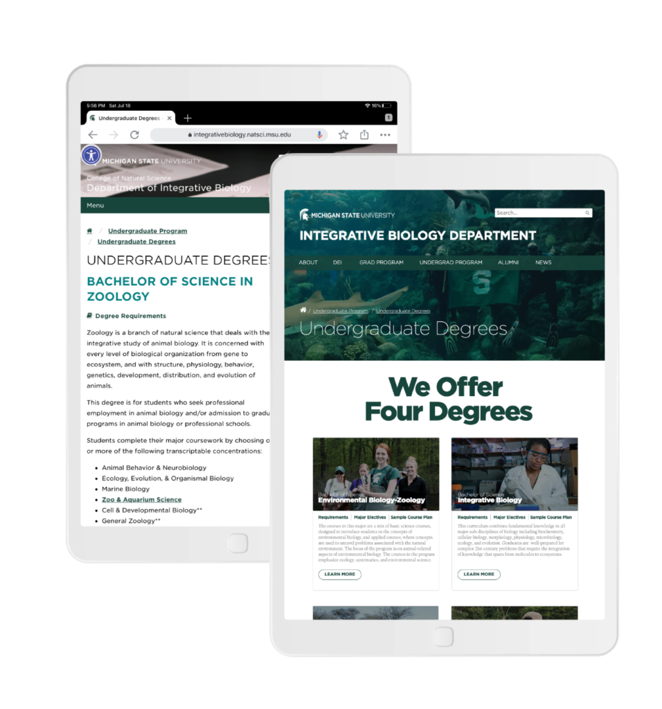
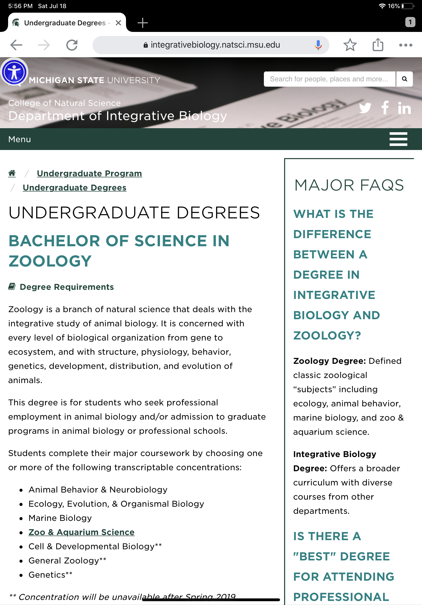
I began designing the website with a paper prototype because it was a quick way to work out and test early design ideas. I rewrote all the headers and web copy, reducing copy volume by more than 50%.
The paper prototype was uploaded into MarvelPop, a tool that makes sketches interactive, and tested with 10 representative students to identify early usability issues, teste copy clarity, and evaluate navigation and task flows. This was the first of numerous rapid feedback loops.
Overall, student feedback was highly positive. Participants found the prototype significantly easier to navigate compared to the current website, with an average usability rating of 8.1 out of 10 and a task completion rate of 73%. One student remarked, "I really like it. I want to use it right now. It's a lot easier to arrange my internship."
Key feedback included a further reduction in text and clearer pathways to action.
High Fidelity Prototypes & Moderated Usability Testing
Refining & Digitizing Design Ideas
Design Iteration 1
Building on insights from the low-fidelity prototype, I developed a high-fidelity digital prototype using Axure. The design emphasized visual clarity, diverse imagery, and reducing the cognitive load.
Student feedback improved further, particularly regarding the organization, design, features, and overall usability of the prototype. Web copy and button micro-copy were further revised to enhance clarity.
Design Iteration 2
A second iteration of the high-fidelity prototype was developed and tested for usability with students. This iteration of moderated usability testing used the same scenarios as those tested with the paper prototype for data comparison.
Overall, the students' average successful completion rate across scenarios increased by 1.85% to 75%. Students' average rating of the high-fidelity prototype's usability (9 out of 10) was an 8.5% increase compared to the paper prototype.
However, students consistently struggled with several scenarios. To reduce user failure, I added multiple routes to key content in the prototyping (i.e., redundancy and error tolerance principles).
Design Iteration Example
The website’s design evolved and improved with each prototype iteration because of student feedback. Each phase of usability testing generated new ideas and refined current concepts. Each prototype was a closer approximation to a final product.
Old Design
Advising was the second most visited page on the website. Data confirmed that the old web design for this page was very text-heavy with few images.
Paper Prototype
Based on student feedback, all advising-related information was consolidated and simplified to one webpage.
During paper prototype usability testing, we found that the recurring "common questions" section was too text-heavy. Only 30% of the students who participated in usability testing read this text. The proposed solution was to separate questions into categories.
The icons at the top of the page were unclickable and didn't serve a real function. That section was removed in the next iteration. Students requested that the "academic resources" be moved to the top of the webpage.
High Fidelity Prototype 1
Observations and scenario data from high-fidelity prototype usability testing showed that students still were not reading text from the "common questions sections," despite breaking the questions up topically with headers. We explored alternative ways to display this information in the next iteration.
We also discovered that some headers and text needed to be rephrased to be more straight-forward.
High Fidelity Prototype 2
Feedback from usability testing was incorporated into this prototype iteration. The "common questions" section was made tabular so less text was visible at once.
Major Comparison Tool
Students were confused about the differences between the department's four majors. A webpage was developed that compares, in detail, all the department majors. This tool would reduce decision complexity and clarify degree differences.
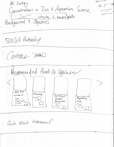
Major-Specific Page
Every student interviewed wished for a webpage that consolidated and curated content specific to their major. This new feature will meet the needs of students in all stages of their challenging academic career (e.g., choosing a major, connecting their major to a career path) while reducing their cognitive load.
Online Paperwork
Many academic resources that were previously only available in person are now available online (e.g., sample course plans, list of approved major electives, internship paperwork). Increasing convenience and accessibility to documentation would support timely action.
Website Demo
Conclusion
Students in the Department of Integrative Biology faced significant behavioral barriers in navigating their academic experience. They were overwhelmed by dense, disorganized information (cognitive overload), struggled to compare major options (choice overload), and lacked clear connections between academic decisions and long-term goals (temporal discounting). These barriers led to indecision, disengagement, and frustration.
Through intentional behavioral design, the prototyped solution I designed addressed these barriers by simplifying the navigation, clarifying decision pathways, and making academic resources more accessible. Students would be able to more easily explore their options, find relevant information, and take proactive academic actions.
Student feedback was overwhelmingly positive. During the final round of testing, students rated their likelihood of recommending the site at 9.5 out of 10, with 10 being the highest score possible. When systems reduce cognitive effort and clearly connect short-term actions to long-term benefits, users naturally engage more and recommend those systems to others. Students also provided comments such as:
- "That's perfect [the major comparison tool]. That's what I always wanted. It would save me hours."
- "It's what I hoped it would be."
Most surprising were the organic comparisons by students and staff between this solution with other websites across the Michigan State University campus. A student mentioned, "If I had this, school would be easier. It's way more user-friendly than any other MSU website. It has everything you need from starting here, classes, to find careers. It would be great for other majors across campus." Meanwhile, an academic advisor from another unit said, "I've seen a lot of webpages in my nine years of advising at MSU. This one is by far the best I've seen."
This solution demonstrated that behavioral design can create more accessible and empowering digital environments for students.
Broader Implications
The implications of this project extended beyond what was initially expected. The data, findings, and design ideas generated from this project:
- Helped guide the department's strategic planning.
- Was used as evidence of the department's commitment to student success in Integrative Biology's [undergraduate] annual program report that has been reviewed by the College of Natural Science's leadership.
- The data fostered the development of a new freshman course that has been incorporated into the department's undergraduate curriculum. This new course connects students with peers and department faculty sooner in their academic careers.
We also discovered that Integrative Biology has been doing some things well:
- All the participants really liked the IBIO Student eNewletter.
- Students have found the IBIO Hands-On Opportunities Database to be useful. Enhancements were suggested to make this database even more useful and easier to use.
Limitations
Like any study, there were limitations. For example, you can only learn so much from interviews. What people say and what they do don't necessarily align. For example, some students said they used FAQs, but then they contradicted themselves later in the interview. If I could do the project over again, I would have supplemented the interviews with a diary study to better capture needs and technology usage.
Another limitation of the project was that students were only recruited using email. In the future, we should also recruit students by making announcements in MSU classrooms. It is possible that our results may have been biased towards students that read their email.