

Susan Wyche, PhD
Designing for Delight
A Behavioral Approach to Enhancing the Zoo Visitor Experience
An innovative tool that utilizes behavioral science to reduce friction and decision ambiguity, support motivation, and elevate moments of delight.

Who I Worked With
My Role
UX Research
UI Design
UX Writing
Research Methods
Contextual Inquiry
Literature Review
Competitive Analysis
Moderated Usability Testing
Evaluation Testing
Tools Used
Adobe Photoshop
UXPin
The Challenge
Making Zoo Visits More Enjoyable, Predictable, and Purposeful
Modern zoos play a critical role in conservation, education, and recreation. But according to the Association of Zoo & Aquariums, the public's favorability of animals in zoos had declined in recent years. Visitors often arrive excited, but leave disappointed, missing the very animals and events they came to see.
Suppose we want people to leave with positive perceptions and lasting memories. In that case, we must design for those very behaviors: navigating with ease, finding what matters most, and feeling immersed in the experience.
This project focused on designing a zoo visitor app that enriches the visitor experience, not by changing visitor behavior directly, but by supporting it. Drawing from behavioral design principles, the app was designed to help guests feel like informed, empowered insiders instead of lost tourists.These nudges laid the groundwork for more positive zoo perceptions and potentially longer-term behavioral spillover.
Design Process
Discovery
Literature Review
What Do We Already Know?
To kick off the project, I referenced scientific literature that has been published on the topic. I discovered that limited research has been conducted about zoo visitors outside the realm of education and learning.

Which Animals Do Visitors Prefer?
Moss and Esson (2010) studied visitor interest in 40 zoo species at the Chester Zoo, the most visited zoo in the United Kingdom. They found that the most predictive indicator of visitor interest in a particular animal was the animal's taxonomic group. Visitors are most interested in mammals and least interested in birds. Other predictors of visitor interest included animal activity, body size (length), and whether the animal was a flagship species (Moss & Esson, 2010). Their findings of visitor interest in animal activity further supported my interview data.
Moss, A., & Esson, M. (2010). Visitor interest in zoo animals and the implications for collections planning and zoo education programmes. Zoo Biology, 28, 1-17. DOI: 10.1002/zoo.20316
What Animal Facts Interest Visitors?
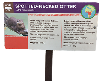
Fraser, Bicknell, Sickler, and Taylor (2009) studied what information visitors would like to know about the animals on their identification labels. Their data suggest that visitors are most interested in odd facts and behaviors, endangered animal status, and where the animal lives in the wild.
Fraser, J., Bicknell, J., Sickler, J., & Taylor, A. (2009). What information do zoo & aquarium visitors want on animal identification labels. Journal of Interpretation Research, 14 (2), 7-19.
Contextual Inquiry & Zoo Visitor Interviews
A Deep Dive into Zoo Visits
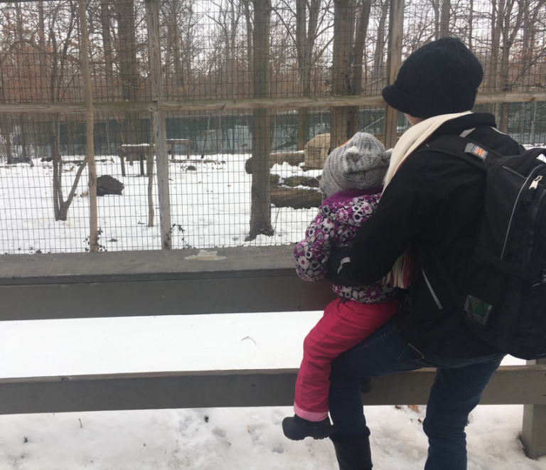
To ensure the project was grounded in real user needs, desk research was supplemented with contextual inquiry, observing zoo visitors in their natural environment. I recruited a diverse group of individuals who had recently visited zoos to:
- Understand the challenges and barriers they encounter during their zoo visits.
- Gain insights into their motivations, expectations, and aspirations for future zoo experiences.
In addition to conducting interviews, I also observed visitors' behavior during their time at the zoo, noting pain points and patterns in their interactions with exhibits and services. These contextual observations helped provide a deeper understanding of their needs and how they engaged with the space.
Emerging Themes From Zoo Visitors
Cognitive Load: Visitors Plan Their Visit Upon Arrival
Visitors arrive without a plan and become overwhelmed by information. This leads to inefficient decision-making in the moment and missed experiences.
Visitors need to know the general layout of the zoo and how to navigate to the exhibits of interest.
Barrier: Navigating the Zoo Can Be Frustrating
The ease at which visitors can navigate the zoo impacts their overall visitor experience. Poor signage, clunky or lost maps, and confusing layouts triggers frustration.
Autonomy: Visitors Want to Move Through the Zoo at Their Own Pace
Visitors want to wander off and do their own thing, see what they want to see, and not hold anyone up.
Expectation Setting: Visitors Want to See Active Animals
Visitors want to see animals active and visible, but struggle to know when or where that will happen. Since most zoo visitors do not understand animal behavior, they cannot accurately predict the best times to view their favorite animals.
Visitors also want to know what animals will be available for viewing before they begin their visit.
Emotional Outcomes: Disappointment Negatively Impacts Future Viists
Moments of delight, surprise, and success are what people remember. It also shapes their future attitudes towards zoos.
Poor animal visibility (e.g., hidden animals, crowded exhibits, etc.) negatively impacts the visitor's experience at the zoo. Viewing animals isn't just a challenge for adults, but also for children.
Strategy
Reduce Friction & Cognitive Load
Make it easier for visitors to plan and navigate their zoo visit without feeling overwhelmed.
Enhance Salience & Attention
Make key experiences more visible, timely, and memorable.
Elevate Motivation & Positive Affect
Reinforce intrinsic motivators (e.g., curiosity, joy, awe) while helping guests feel in control and engaged.
Using sketching as a primary tool for brainstorming, I explored over 50 ideas, guided by behavioral science. The range of ideas included everything from robotic animals to mobile app features. Of the concepts developed through brainstorming, approximately 10 were successfully integrated into the final design solution.
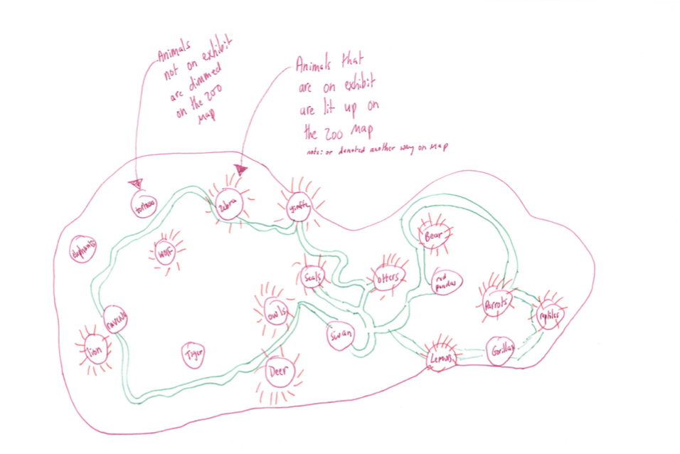
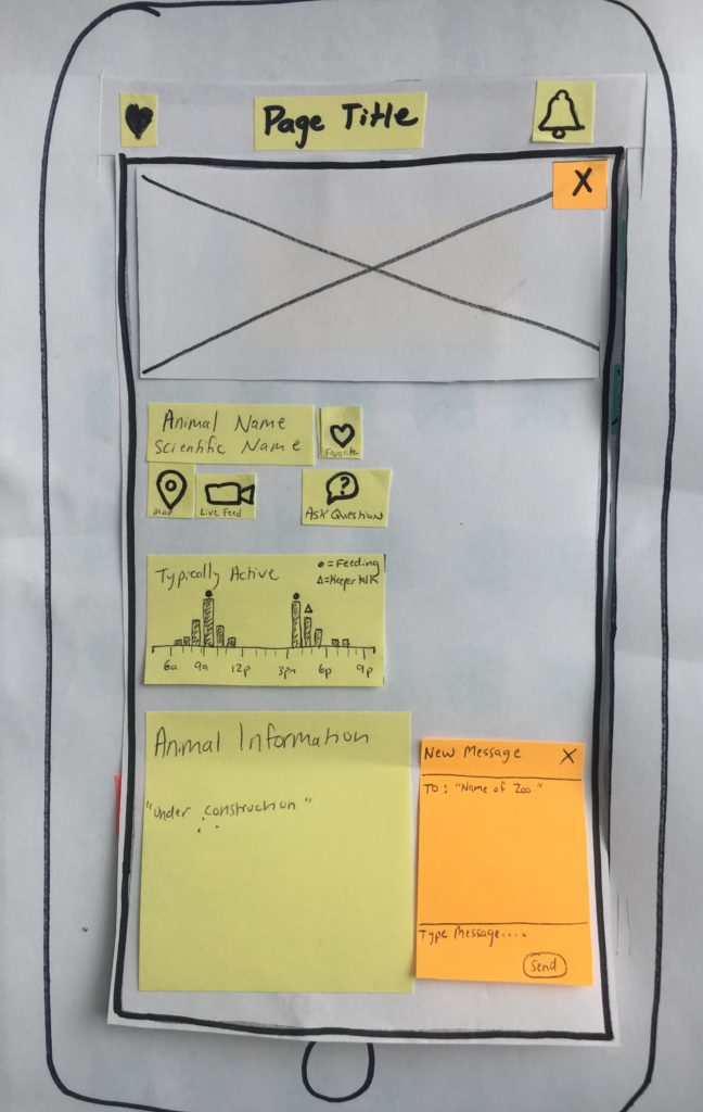
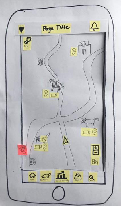
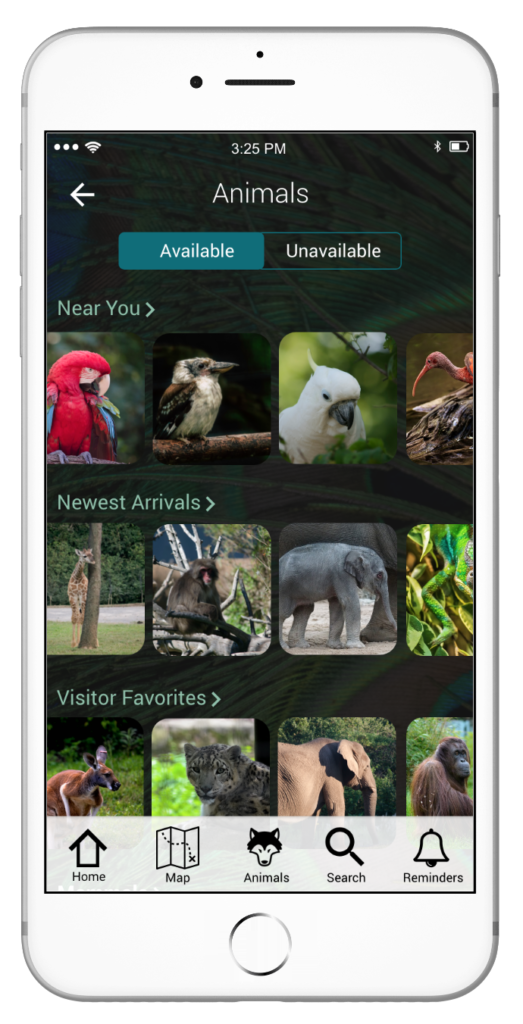
Animal Off Exhibit Map to Decrease Friction: A map that dynamically shows closed exhibits saves unnecessary walking.
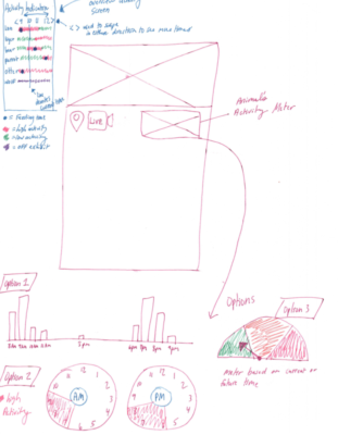
Animal Activity to Increase Salience: A meter displaying an animal’s typical activity throughout the day can help visitors plan their visit.
Competitive Analysis
What Are Current Zoos Apps Like?
To get a better understanding of the zoo apps currently on the market, I conducted a competitive analysis. The nine zoos included in the competitive analysis included a mix of large and small zoos that have an app for their facility. The features compared across apps were based on user data and potential design ideas for this project. A representative sample of the competitive analysis is below.
| Features | Bronx Zoo | Denver Zoo | Greenville Zoo | San Diego Zoo | Zoo Miami |
|---|---|---|---|---|---|
| Map | Interactive | Interactive | Interactive | Interactive | |
| Navigation | |||||
| Schedule | |||||
| Best Viewing Time | |||||
| Animal Information | |||||
| Access Animal Info From Map | |||||
| Submit Questions | |||||
| Live Video Feed | Giraffes | ||||
| Animals Off Exhibit | |||||
| Set Reminders | |||||
| Call Security | |||||
| Search |
The competitive analysis revealed several key trends and insights about zoo apps:
- Common Features: Most zoo apps included basic animal information and a zoo map, though additional features varied across apps.
- Map Usability: Several maps were difficult to navigate (e.g., in PDF format), and in most cases, animal information was not easily accessible. Animal details were typically organized by taxonomy, which was not always intuitive for users.
- Content Limitations: With the exception of the Adelaide Zoo, most apps only featured animal images rather than more detailed content or multimedia.
- User Research: The Bronx Zoo was the only institution in the analysis that incorporated user experience research into the development of its app. Their straightforward design included an interactive map, exhibit distances, and closed exhibit alerts.
Overall, I discovered that many of my design ideas were not available in current products on the market – especially collectively in one app.
Why Chose a Mobile App?
- My research confirmed that visitors were already using their phones at the zoo.
- Easy to update.
- An app supports zoos' green initiatives.
- The flexibility and capabilities of an app could address many of the challenges, needs, and wishes of zoo visitors.
Design & Testing
Paper Prototype & Testing
Working Out Design Ideas
I began designing the app with a paper prototype as an inexpensive way to test out ideas and determine requirements. These designs were tested with zoo visitors.
Testing confirmed I needed to simplify the app and add several enhancements. For example, each person loved the idea of being able to set reminders, but they wanted more contextual information provided.
The user feedback was incorporated into the next prototype iteration.
High Fidelity Prototypes & Testing
Refining & Digitizing Designs
I created a clickable high-fidelity prototype using UXPin. The app’s design continued to be refined with each iteration of user testing.
Design Iterations
Paper Prototype
Usability testing data confirmed the map needed to be simplified. The map was too cluttered with icons, the icon choices were confusing to users, and users did not use the map key.
Users primarily accessed the individual animal pages directly from the map, so that feature was kept in the map design.
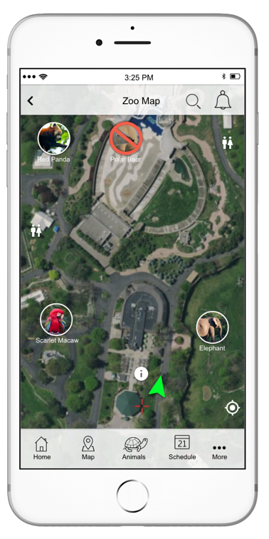
High Fidelity Prototype 1
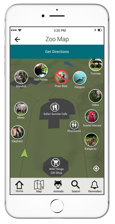
During usability testing, users mentioned that the icons on the map were difficult to see. This problem was fixed in the next prototype by removing the satellite imagery.
At the beginning of the project, it was unclear whether users needed turn-by-turn navigation. This feature was mentioned during multiple iterations of usability testing, so I incorporated the idea into the next prototype iteration.
High Fidelity Prototype 2
User feedback from the usability testing did not warrant additional changes, so this design was used for evaluation testing.
Final Product
During evaluation testing, I discovered that there was an issue with "Get Directions" salience. This feature remained unnoticed even after viewing the map multiple times.
The size of the ‘get directions’ text was increased on the map and coupled with a navigation icon used elsewhere in the app.
Evaluation Testing
Formal Testing & Finetuning App
This formal evaluation of the app was a combination of (1) users completing think-aloud scenarios with the high-fidelity prototype and (2) post-test questions. The data collected from the evaluation was used to guide design decisions to improve the ease of use and user satisfaction with the app. All evaluation testing was conducted in controlled settings.
Evaluation testing participants were from a broad age demographic (i.e., 20s-60s). All of the participants had previously visited zoos, but none had ever used a zoo app.
Finding 1. Swipe Up Arrow was Not Intuitive
The key problem identified was that all the participants struggled with the swipe up arrow. Consequently, they had difficulty finding information to complete several of the scenarios.
All users recommended adding text labels next to the swipe up arrows to give users a clue as to what additional information they can access. This change was incorporated into the final prototype.
before
After
Finding 2. Increase Salience of Several Features
Another app issue that arose was the salience of several interfaces, such as the toggle on the animal page. Only minor design changes were needed to make these features more salient in the prototype. For example, the color of the available/unavailable toggle on the animal page was changed to an accessible, higher contrast color.
before
After
Finding 3. App Exceeded Evaluation Criterions
Based on the criteria set in the evaluation plan, the zoo visitor app was a success:
- Decision Confidence: Users felt more capable and in control
- Emotional Resonance: Testers expressed delight at the personalized features
- Reduced Missed Opportunities: App features support better timing and satisfaction
All the scenarios were completed with a completion rate of 75% or higher, exceeding the success criteria.
Finding 4. Overall User Feedback Was Positive
The app received glowing feedback about its key features and usability. For example, one participant commented, "It’s appealing, easy to use. I like how you’ve streamlined it. It has so much in there but yet it’s not overwhelming.” Another person mentioned, “I am really impressed by it. I think that it looks really good and that it’s all really intuitive.”
All participants really liked the app’s features (e.g., reminders) and the app’s built-in redundancy so that they could accomplish their goal in numerous ways. In fact, one participant said, “I like the multi-faceted approach to it…there are different ways you can customize it to yourself. I think that is really nice.”
When asked at the beginning if they had ever used a zoo app, none of the users seemed particularly enthusiastic about using a zoo app. By the end of the testing, each expressed interest in using the app during their zoo visits.
Final Product
App Key Features
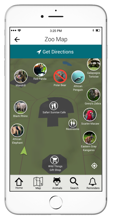
Feature 1. Interactive Map & Navigation
Navigating the zoo is one of the visitor’s biggest challenges they face during their visit. Benefits of a digital map include:
- Reduces cognitive load
- Helps users avoid disappointment with clear indicators of animal availability
- Is available from anywhere in the zoo
- Cannot be lost
- Can be updated regularly
- Can help visitors navigate from point A to point B
The map was designed so visitors can quickly and easily access high-priority information (e.g., turn-by-turn navigation, animal information) directly from the map.
Feature 2. Animal Activity Graph
Visitors are most interested in viewing animals when the animals are active and doing entertaining behaviors. These delightful and memorable moments shape positive zoo experiences. However, the typical zoo visitor does not understand animal behavior.
The app includes an activity graph for each species, which indicates the animal's typical activity levels throughout the day. The graph can be used to help visitors plan their optimal timing for engagement with zoo animals (i.e., affective forecasting).
Feature 3. Live Video Feed
Visitors want to see the animals during their zoo visit. The app includes a live video feed to improve animal visibility or maintain engagement with the animals. The video feed(s) provide alternate ways for visitors to view inside an exhibit, see an animal when it's hiding, when visitors are across the zoo, etc.
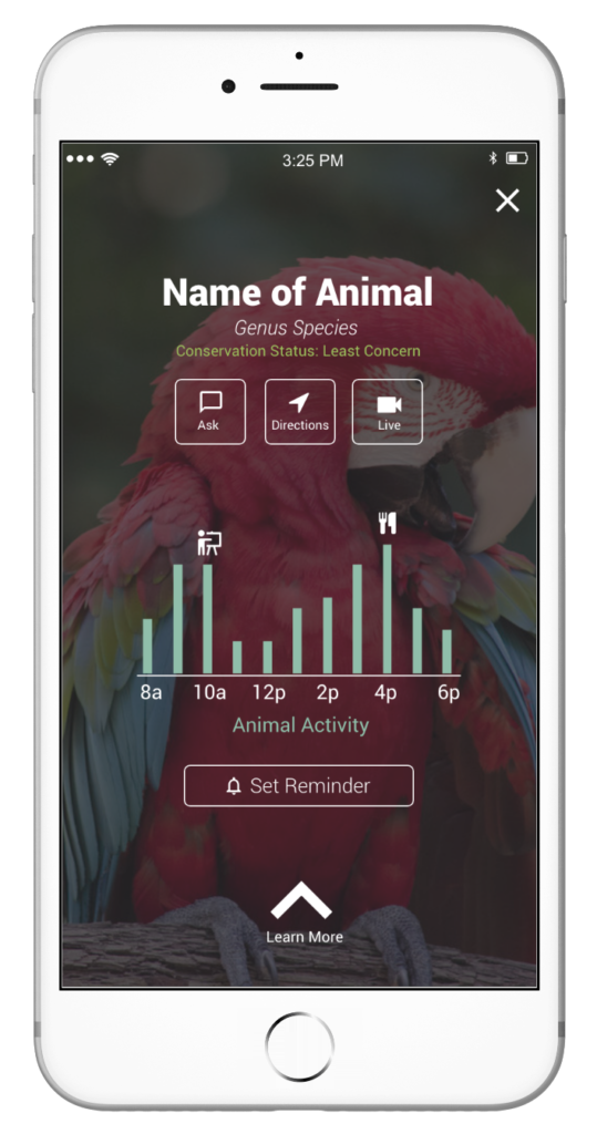
Feature 4. Custom Reminders
During the discovery phase, a user commented that she regularly checks the time on her phone at the zoo so she doesn't miss the scheduled zoo activities (e.g., keeper talks) she wants to attend. This inspired the Set Reminders Feature to reduce user reliance on their working memory.
This feature allows users to set a tactile and sound alarm for:
- An activity on the zoo schedule
- When to visit a specific animal exhibit
Users can customize how far in advance they want to be notified. To help with logistical planning, the app shows users the estimated walking time from both their current location and the furthest exhibit from their final destination.
These reminders encourage proactive, goal-directed behavior of zoo visitors.
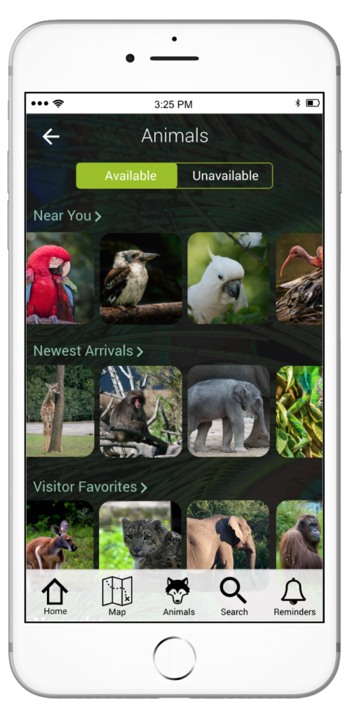
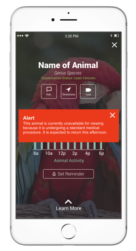
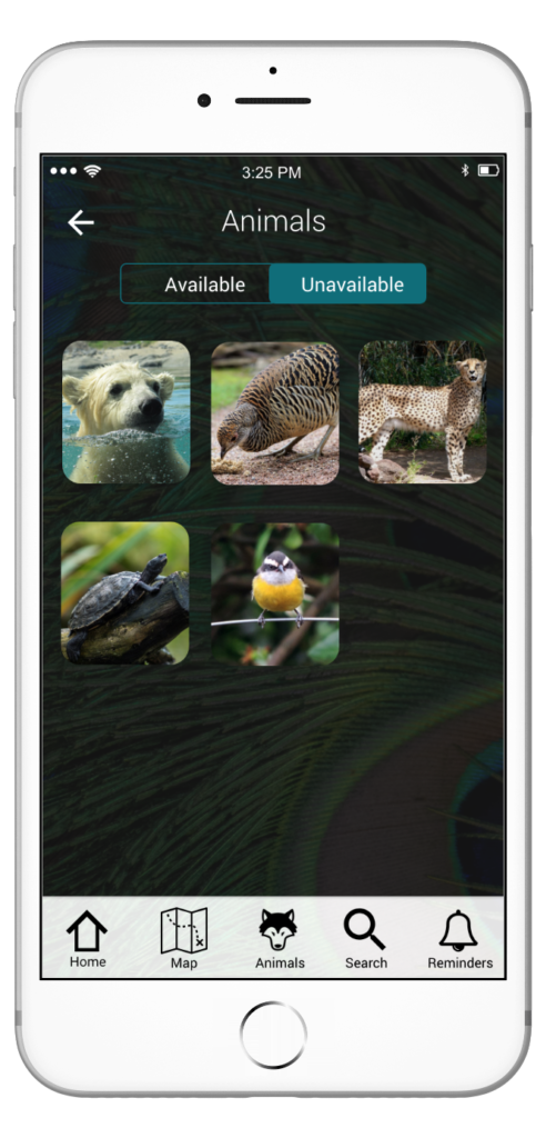
Feature 5. Animals Unavailable for Viewing Redundancy
Visitors arrive at the zoo expecting to see certain animals. Participants wished they could have a list of which animals are off-exhibit (and why) before they are immersed in their visit. Having this information upfront could help the visitors plan a more enjoyable visit. Not only would it decrease emotional disappointment and abate challenging child management situations, but also help visitors save some steps.
The app clearly denotes, in three different ways, which animals are currently unavailable for viewing. The redundancy was intentional to help users access this critical information no matter how they use the app. This promotes a sense of control and reduces ambiguity.
Option 1

Option 2
Option 3
Conclusion
This project used behavioral design to enable better decisions, reduce friction, and elevate emotional moments to have more fulfilling zoo visits. During evaluation testing, visitors reported improved confidence and clarity. The app laid the groundwork for behavioral spillover, such as future visits, increased favorability, and deeper engagement with zoo missions.
The zoo app also included many new features compared to competitors on the market. These features were developed based on data and feedback collected from real zoo visitors. The data suggest that what visitors want and what zoos think visitors need are not necessarily aligned. By listening to user needs, I was able to design a product sought by users.
Feedback
Overall, feedback about this new zoo visitor app was very positive from all users. In fact, one usability testing participant mentioned, “I wish it was real.” Prior to this study, none of the participants (i.e., zoo visitors) I spoke with had ever used a zoo app. One participant had commented, “I have never used a zoo app. I’ve never even thought about one.” By the end of each evaluation testing session, users expressed interest in using the app during their zoo visit(s). One participant said, “When you first talked about this, I really couldn’t foresee me using one very often. I could see myself using this at every zoo I go to.”
Next Steps
This project was a pilot study. Due to time constraints, only a very small, representative sample of zoo visitors were interviewed at the beginning of the study. The data collected from these participants were used as inspiration for design. A more formal data analysis is needed to tease out additional insights.
Numerous design ideas and potential enhancements arose during evaluation testing. Particularly exciting ideas were to (1) link events and scheduled reminders to the map, (2) incorporate alternate modes of transportation into navigation, and (3) visitor activity graphs at individual exhibits. This could be a potential solution to solve the crowded exhibits problem idenitifed during the research phase.